A frame can have an outline you like and a colour you cannot decide about. A haircut may sit well around your cheeks while the colour in the reference photograph feels unrelated to you. These are useful distinctions. Face shape and skin tone describe different things: one concerns proportions and outline, the other concerns colouring. Keeping the observations separate makes it easier to choose glasses, clothes or accessories without asking one label to answer every styling question.
Separate the outline you see from the colour around it
Face shape describes broad relationships between the forehead, cheekbones, jaw and chin. You might notice a longer outline, a fairly broad jaw or a gradual taper toward the chin. Familiar labels such as oval, round and square organise those observations, although their boundaries are loose. They do not tell you which colours are present in your skin.
Skin tone is used in several ways in everyday conversation. It may refer to how light or deep the skin appears, its overall colour, or a combination of surface appearance and undertone. Someone else may use the same phrase more narrowly. Before comparing advice, check what the person means.
You can examine the two subjects with different questions. For the outline, ask where the face is widest and how the lower half narrows. For colour, ask how a particular fabric or frame looks beside your skin in consistent light. The first question might help you choose between a deep and shallow lens. The second might help you choose between the same frame in two colours.
Neither description determines the other. A longer face does not imply a particular undertone, and a skin-colour description does not establish the width of the jaw. Keep race and ancestry out of those deductions too. They cannot replace an observation of the individual in front of the mirror, and they are not a shortcut to choosing a personal palette or a face-shape label.
Understand what olive describes before using the label
In styling and makeup discussions, olive describes colouring or an undertone, often understood as a muted greenish or grey-green cast within the skin's overall appearance. People use the term with different degrees of precision. It is not a geometric shape. The phrase “olive face shape” mixes a colouring description with an outline description and cannot tell you whether a face is round, oval, angular or tapered.
Do not use olive as another word for one skin-depth category. Depth and undertone are different observations, and an olive description does not assign someone a fixed level of lightness or darkness. It also does not establish an ethnic background. If you are discussing makeup, explain the colour mismatch you actually see instead of relying on assumptions attached to the label.
For example, you might find that one base product appears too pink beside your neck while another looks too orange. That is concrete information for comparing shades, though it does not prove an undertone by itself. The product's own colour, the amount applied and the light in the room all affect the comparison. A shade name containing “olive” remains a brand's description, not a guaranteed match.
There is no need to settle this label before buying a scarf or choosing a frame. You can compare the actual colours beside your face and decide what you enjoy. A useful description should help you communicate an observation; it should not make an ordinary styling choice depend on passing a test with a supposedly definitive answer.
Use proportions to compare lines and scale
When the decision concerns shape, keep colour reasonably similar at first. Try two glasses frames in the same general colour, for example, and compare the lens height, rim shape and overall width. This helps you see whether you prefer a curved outline, a strong top edge or a frame that occupies more space around the eyes.
A rounded frame can repeat a soft curve in the face, while a straighter rim can introduce a different line. Neither is required for a particular category. If you like repeated curves, you do not need to add corners because a chart tells you to create contrast. Describe the effect you want rather than treating your outline as a problem to solve.
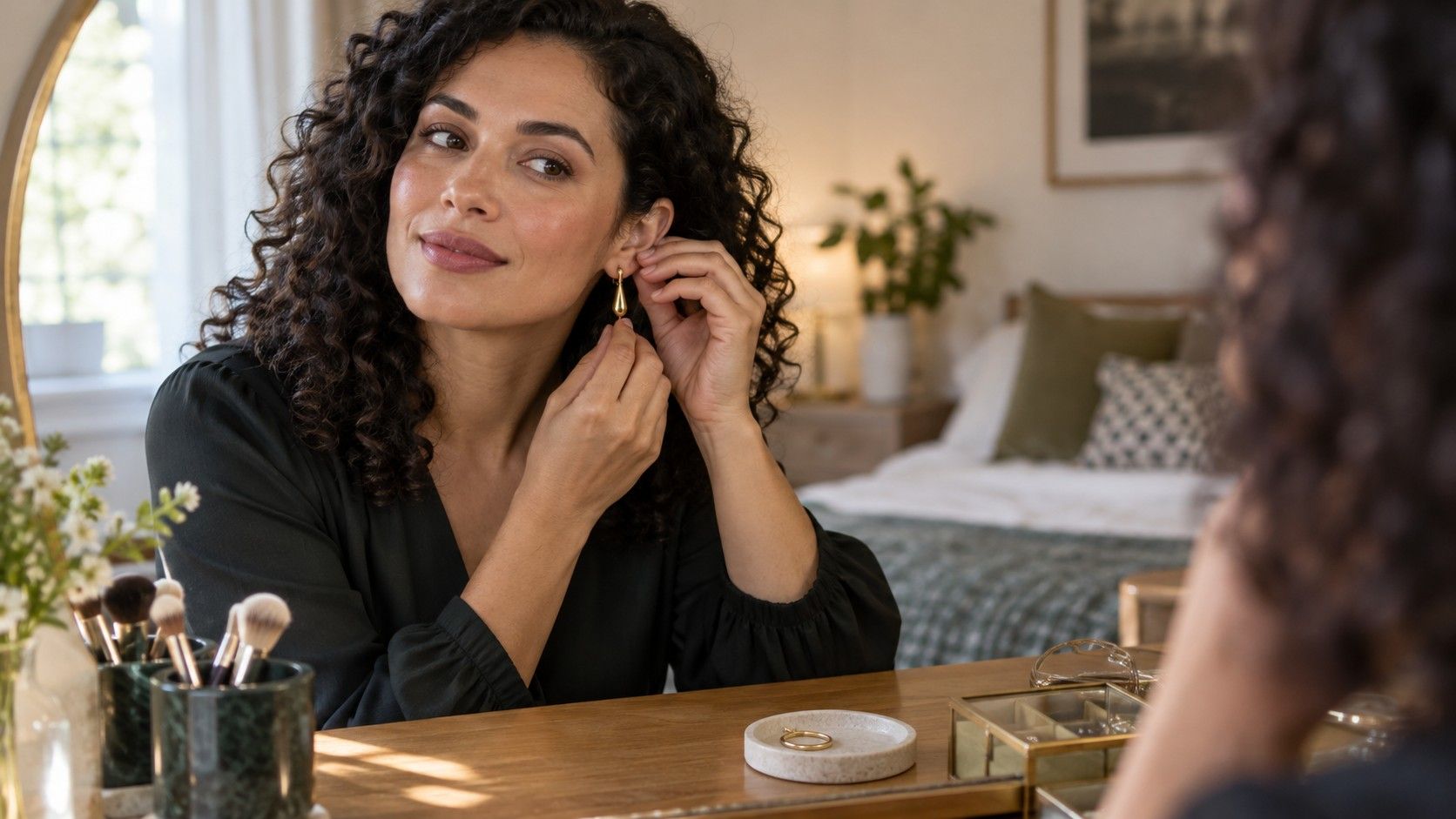
The same principle works with earrings. Compare the apparent size, length and movement beside your cheek and jaw, while keeping the material colour similar if you can. A long pendant and a small stud create different relationships with the face. Hair worn down may conceal one option, so try the earrings with the hairstyle you expect to wear.
Necklines bring in the neck, shoulders and the rest of the garment. Face shape alone cannot predict how a neckline will look as part of an outfit. Stand far enough from the mirror to see those relationships. A close face photograph is an incomplete reference for deciding between a high collar and an open neckline.
Compare clothing colours under consistent conditions
For colour, choose a simple comparison you can repeat. Hold two fabrics near the face in the same place and under the same light. A soft daylight position can be a useful starting point, provided the light is not changing rapidly. Avoid comparing one scarf beside a bright window and the next under a warm ceiling lamp.
Remove a strongly coloured scarf or jacket that might distract from the test, and pay attention to what you are comparing. A shiny satin and a matte knit can differ in reflection as well as colour. If possible, start with fabrics of a similar texture. You can return to the effect of sheen after narrowing the colours.
Decide what “works” means to you. You may prefer a quiet relationship between clothing and skin, a strong colour statement or a shade that repeats an accessory. Those are different goals. Instead of declaring that a colour universally suits or fails you, note the effect: the scarf is the first thing you notice, the colour feels subtle, or the darker shade creates the contrast you wanted.
Makeup, hair colour and glasses are part of the current appearance too. A comparison without makeup can help isolate one variable, but you should also look at the clothing with the makeup you intend to wear. There is little benefit in choosing a colour solely for a bare-face test if you plan to wear it as part of a different, deliberate look.
Be cautious about a verdict from one photograph
A photograph introduces several changes at once. Camera distance and head position affect the apparent proportions, while light and image processing affect the colour. An automatic white-balance adjustment may make one photograph warmer or cooler than another. That can make a colour comparison seem decisive when the camera has altered the conditions.
Keep a useful reference image straightforward: face near the centre, camera around face level, hair positioned so the outline is visible and no beauty filter. For clothing comparisons, keep the camera position and light the same. Even then, treat the image as another view of the outfit rather than an exact colour record.
Look back at the mirror after reviewing photographs. If a fabric looks different on the phone screen, do not automatically conclude that the mirror is misleading. The screen, the picture and the room each influence the appearance. For a purchase, assess the actual item when possible and check return terms if you must order from a photograph.
Bring the two observations together in one choice
Suppose you are choosing glasses. First find a shape and size that sit comfortably: stable bridge, comfortable temples and no unwanted contact with the cheeks. Compare the overall outline in the mirror. Once that is settled, try the same model in another colour if it is available. You can now assess the colouring without losing track of the fit you already checked.
For an outfit, begin with the item that matters most to you. If you love the line of a jacket, keep it on while comparing two scarves. If the colour of a shirt is the main attraction, try different accessories without replacing the whole outfit each time. Changing one element makes it easier to understand why the second version feels different.
There will be trade-offs. The frame with your favourite colour may have a bridge that does not sit comfortably; the neckline you enjoy may not work with the necklace you planned. Decide which requirement matters for that occasion and look for another option where necessary. A face-shape label or an undertone label cannot remove those practical choices.
Keep a small vocabulary of observations you can reuse: a longer outline, a tapered lower face, a preference for muted colours, a liking for a strong dark rim. You can revise any of them as your hair, wardrobe or preferences change. The goal is a style decision that makes sense to you, with shape and colour each contributing the information they can actually provide.